Sale

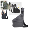
Crossbody bag for touch screen phone Livraison rapide
Le prix initial était : €8.49.€4.58Le prix actuel est : €4.58.
41 people are viewing this product right now
Crossbody bag for touch screen phone
div::after,
.ddr-page-wrapper .ddr-page>div::before {
content: « »;
display: table;
clear: both;
}
.ddr-page-wrapper div,
.ddr-page-wrapper h1,
.ddr-page-wrapper h2,
.ddr-page-wrapper h3,
.ddr-page-wrapper h4,
.ddr-page-wrapper h5,
.ddr-page-wrapper h6,
.ddr-page-wrapper p,
.ddr-page-wrapper span {
line-height: normal;
}
.big-loader-wrapper {
position: relative;
height: 150px;
width: 100%;
display: flex;
justify-content: center;
align-items: center;
background: rgba(212, 211, 211, 0.5);
z-index: 1;
}
.big-loader-wrapper .big-loader {
padding-top: 20px;
display: block;
height: 64px;
width: 64px;
background-color: rgba(255, 255, 255, 0.1);
border-radius: 50%;
border-width: 3px;
border-style: solid;
border-color: rgb(1, 154, 149) rgb(226, 118, 37);
animation: 1s ease 0s infinite normal none running spin;
}
.ddr-page-row,
.ddr-page-section-wrapper .ddr-page-section {
position: relative;
box-sizing: border-box;
}
.ddr-page-row {
display: flex;
width: 100%;
}
.ddr-page-row__wrap {
flex-wrap: wrap;
}
.ddr-page-rowwrap .ddr-page-columnwrap {
width: 100% !important;
}
.ddr-page-row__wrap-reverse {
flex-wrap: wrap-reverse;
}
.ddr-page-rowwrap-reverse .ddr-page-columnwrap-reverse {
width: 100% !important;
}
.ddr-page-column {
display: flex;
flex-wrap: wrap;
box-sizing: border-box;
position: relative;
align-content: flex-start;
}
.ddr-page-widget {
width: 100%;
position: relative;
overflow: hidden;
}
.dashed-border {
border: 1px dashed rgb(135, 135, 135);
}
.headline-edit-wrapper {
cursor: text;
}
.ddr-widget__navigation .menu {
font-family: inherit;
}
.ddr-widget__navigation .menu ul {
list-style: none;
margin: 0px;
padding: 0px;
display: flex;
flex-wrap: wrap;
}
.ddr-widget__navigation .menu ul li>ul {
display: flex;
visibility: hidden;
position: absolute;
flex-direction: column;
padding-bottom: 100%;
}
.ddr-widget__navigation .menu ul li>ul li {
width: 100%;
position: relative;
}
@media (min-width: 40em) {
.ddr-widget__navigation .menu ul li>ul li>ul {
top: 0px;
position: absolute !important;
left: 100% !important;
}
}
.ddr-widget__navigation .menu ul li:hover>ul {
visibility: visible;
position: relative;
left: 0px;
}
.ddr-widget__navigation .menu .sub-menu li>a {
color: inherit;
}
.ddr-widget__navigation .menu .sub-menu>a::after {
content: « + »;
padding-left: 5px;
}
.ddr-page-widget__navigation {
overflow: visible !important;
}
.ddr-page-widget__navigation .ddr-widget {
overflow: visible;
}
.ddr-page-widget__navigation .ddr-widget .menu>ul>li,
.ddr-page-widget__navigation .menu>ul>li {
position: relative;
}
.ddr-page-widget__navigation .menu li ul {
width: 100%;
z-index: 99;
padding-bottom: 0px;
position: absolute !important;
}
.navigation-widget-modal-settings {
background: rgb(39, 44, 51);
width: 800px !important;
height: 600px !important;
}
.navigation-widget-modal-settings .modal__header {
background: rgb(48, 51, 56);
}
.navigation-widget-modal-settings .modal__content {
padding: 30px;
}
.navigation-widget-modal-settings .modal__footer {
display: flex;
align-items: flex-end;
}
.navigation-widget-modal-settings .modal__footer>div {
width: 100%;
}
.navigation-widget-modal-settings .modal__footer button {
margin: 0px;
}
.widget-settings-wrapper {
display: inline-flex;
color: rgb(244, 244, 244);
font-family: « Open Sans », sans-serif;
}
.widget-menu-settings {
text-align: left;
color: rgb(255, 255, 255);
padding: 0px;
}
.widget-settings-navigation {
width: 360px;
height: 400px;
display: block;
background: rgb(39, 44, 51);
}
.widget-settings-navigation>button {
margin-top: 0px;
background-color: rgb(16, 126, 142);
color: rgb(255, 255, 255);
text-transform: uppercase;
}
.widget-settings-navigation>button:hover {
background-color: rgb(31, 140, 155);
}
.widget-settings-navigation-edit {
padding: 0px;
width: 370px;
margin-left: 10px;
box-sizing: border-box;
background: rgb(39, 44, 51);
max-height: 440px;
overflow: auto;
}
.widget-settings-navigation-edit .widget-menu-settings {
font-family: « Open Sans », sans-serif;
text-indent: 15px;
padding: 0px;
}
.navigation-bar-items::-webkit-scrollbar,
.widget-settings-navigation-edit::-webkit-scrollbar {
width: 7px;
}
.navigation-bar-items::-webkit-scrollbar-track,
.widget-settings-navigation-edit::-webkit-scrollbar-track {
box-shadow: rgb(0, 0, 0) 0px 0px 6px inset;
}
.navigation-bar-items::-webkit-scrollbar-thumb,
.widget-settings-navigation-edit::-webkit-scrollbar-thumb {
background-color: rgb(81, 89, 103);
outline: rgb(81, 89, 103) solid 1px;
}
.accordion {
position: relative;
background: rgb(48, 51, 56);
color: rgb(109, 111, 113);
cursor: pointer;
padding: 18px;
width: 90%;
border-bottom: 1px solid rgb(39, 44, 51);
text-align: left;
outline: none;
font-size: 15px;
transition: all 0.4s ease 0s;
display: inline-flex;
justify-content: space-between;
}
.accordion .nav-item-options-trigger {
background: none;
outline: none;
border: none;
cursor: pointer;
}
.accordion .nav-item-options-trigger i {
font-size: 16px;
}
.accordion .nav-item-options-menu {
position: absolute;
right: 40px;
top: 27px;
z-index: 1;
border: 1px solid;
}
.accordion .nav-item-options-menu button {
display: block;
background: rgb(255, 255, 255);
outline: none;
border: none;
width: 100%;
text-align: left;
padding: 8px 10px;
cursor: pointer;
transition: all 0.4s ease 0s;
font-size: 16px;
}
.accordion .nav-item-options-menu button i {
color: rgb(0, 0, 0);
margin-right: 5px;
transition: all 0.4s ease 0s;
}
.accordion .nav-item-options-menu button:hover {
background: rgb(39, 44, 51);
color: rgb(255, 255, 255);
}
.accordion .nav-item-options-menu button:hover i {
color: rgb(255, 255, 255);
}
.navigation-bar-items {
width: 100%;
height: 400px;
overflow-y: auto;
}
.accordion:hover,
.active {
background-color: rgb(255, 255, 255);
}
.nav-item-title {
color: rgb(255, 255, 255);
display: flex;
}
.nav-item-options {
display: flex;
}
.nav-item-options i {
color: rgb(255, 255, 255);
}
@keyframes disableClick {
100% {
pointer-events: all;
}
}
.section-slider .ddr-page-section-widget-drop-suggestion-wrapper {
padding-bottom: 7px;
}
.ddr-page-widget__sections-slider .toolbox-controls {
justify-content: flex-start !important;
}
.slide-options-wrapper {
border-bottom: 1px solid rgb(226, 118, 37);
}
.slide-options-wrapper .rc-collapse-content-active {
background-color: rgb(23, 23, 23);
}
.slide-options-wrapper .rc-collapse-content-active .section-slider-delete-icon.slide-delete-icon {
background: rgb(239, 83, 80);
color: rgb(255, 255, 255);
align-items: center;
border-radius: 3px;
}
.slide-options-wrapper .rc-collapse-content-active .section-slider-delete-icon.slide-delete-icon i {
color: rgb(255, 255, 255) !important;
}
.slide-options-wrapper .rc-collapse-content-active .switch-wrapper .switch {
margin-left: -10px;
}
.slide-options-wrapper:last-child {
margin-bottom: 24px;
}
.ddr-widget-toolbox–section-slider .toolbox-controls .ddr-widget-toolbox__sub-tool–drag,
.ddr-widget-toolbox–section-slider .toolbox-controls .ddr-widget-toolbox__sub-tool–duplicate,
.ddr-widget-toolbox–section-slider .toolbox-controls .ddr-widget-toolbox__tool–drag,
.ddr-widget-toolbox–section-slider .toolbox-controls .ddr-widget-toolbox__tool–duplicate,
.ddr-widget-toolbox–section-slider .toolbox-controls .ddr-widget-toolbox__tool–move,
.ddr-widget-toolbox–section-slider .toolbox-controls .ddr-widget-toolbox__tool–settings {
background-color: rgb(226, 118, 37);
}
.ddr-widget-toolbox–section-slider .toolbox-controls .ddr-widget-toolbox__tool–delete {
background-color: rgb(72, 72, 72);
}
.ddr-widget-toolbox–section-slider .toolbox-controls .ddr-widget-toolboxtool.ddr-widget-toolboxtool–delete:hover {
background-color: rgb(58, 65, 74);
}
.ddr-widget-toolbox–section-slider .toolbox-controls .ddr-widget-toolbox__tool:hover {
background-color: rgb(239, 56, 27);
}
.ddr-page-widget-overlay-wrapper:hover .ddr-widget-toolbox–section-slider {
border: 2px solid rgb(226, 118, 37) !important;
}
.ddr-widget-toolbox–active.ddr-widget-toolbox–section-slider {
border: 2px solid rgb(226, 118, 37);
}
.ddr-widget {
background-color: transparent;
background-image: none;
inset: auto;
height: auto;
width: auto;
max-height: none;
max-width: none;
min-height: 0px;
min-width: 0px;
padding: 0px;
margin: 0px;
overflow: hidden;
}
.ddr-widget__rich-text {
position: relative;
cursor: auto;
overflow-wrap: break-word;
overflow: hidden;
}
.ddr-widget__image {
position: relative;
max-width: 100%;
height: auto;
margin: auto;
display: flex;
}
.ddr-widget__image a,
.ddr-widget__image img {
overflow: hidden;
width: 100%;
max-width: 100%;
max-height: 100%;
}
.ddr-widget__image a,
.ddr-widget__image a:active,
.ddr-widget__image a:focus,
.ddr-widget__image a:hover,
.ddr-widget__image a:link,
.ddr-widget__image a:visited {
display: inline-block;
vertical-align: middle;
color: inherit;
text-decoration: none;
border: none;
box-shadow: none;
}
@media (min-width: 1281px) {
.ddr-page-row__wrap–max {
flex-wrap: wrap;
}
.ddr-page-rowwrap–max .ddr-page-columnwrap–max {
width: 100% !important;
}
.ddr-page-row__wrap-reverse–max {
flex-wrap: wrap-reverse;
}
.ddr-page-rowwrap-reverse–max .ddr-page-columnwrap-reverse–max {
width: 100% !important;
}
.ddr-page-column__hide–max,
.ddr-page-widget__hide–max {
display: none;
}
}
@media (max-width: 1280px) and (min-width: 1025px) {
.ddr-page-row__wrap–1280 {
flex-wrap: wrap;
}
.ddr-page-rowwrap–1280 .ddr-page-columnwrap–1280 {
width: 100% !important;
}
.ddr-page-row__wrap-reverse–1280 {
flex-wrap: wrap-reverse;
}
.ddr-page-rowwrap-reverse–1280 .ddr-page-columnwrap-reverse–1280 {
width: 100% !important;
}
.ddr-page-column__hide–1280,
.ddr-page-widget__hide–1280 {
display: none;
}
}
@media (max-width: 1024px) and (min-width: 769px) {
.ddr-page-row__wrap–1024 {
flex-wrap: wrap;
}
.ddr-page-rowwrap–1024 .ddr-page-columnwrap–1024 {
width: 100% !important;
}
.ddr-page-row__wrap-reverse–1024 {
flex-wrap: wrap-reverse;
}
.ddr-page-rowwrap-reverse–1024 .ddr-page-columnwrap-reverse–1024 {
width: 100% !important;
}
.ddr-page-column__hide–1024,
.ddr-page-widget__hide–1024 {
display: none;
}
}
@media (max-width: 768px) and (min-width: 481px) {
.ddr-page-row__wrap–768 {
flex-wrap: wrap;
}
.ddr-page-rowwrap–768 .ddr-page-columnwrap–768 {
width: 100% !important;
}
.ddr-page-row__wrap-reverse–768 {
flex-wrap: wrap-reverse;
}
.ddr-page-rowwrap-reverse–768 .ddr-page-columnwrap-reverse–768 {
width: 100% !important;
}
.ddr-page-column__hide–768,
.ddr-page-widget__hide–768 {
display: none;
}
}
@media (max-width: 480px) and (min-width: 321px) {
.ddr-page-row__wrap–480 {
flex-wrap: wrap;
}
.ddr-page-rowwrap–480 .ddr-page-columnwrap–480 {
width: 100% !important;
}
.ddr-page-row__wrap-reverse–480 {
flex-wrap: wrap-reverse;
}
.ddr-page-rowwrap-reverse–480 .ddr-page-columnwrap-reverse–480 {
width: 100% !important;
}
.ddr-page-column__hide–480,
.ddr-page-widget__hide–480 {
display: none;
}
}
@media (max-width: 320px) and (min-width: 0px) {
.ddr-page-row__wrap–320 {
flex-wrap: wrap;
}
.ddr-page-rowwrap–320 .ddr-page-columnwrap–320 {
width: 100% !important;
}
.ddr-page-row__wrap-reverse–320 {
flex-wrap: wrap-reverse;
}
.ddr-page-rowwrap-reverse–320 .ddr-page-columnwrap-reverse–320 {
width: 100% !important;
}
.ddr-page-column__hide–320,
.ddr-page-widget__hide–320 {
display: none;
}
}
#ddr-rich-text-000 * {
line-height: 1.6;
}
[data-ddr-page-widget-additional-css-id= »34805d82cd »] {
font-family: ‘Roboto’, sans-serif;
}
#ddr-rich-text-001 * {
line-height: 1.6;
}
undefined[data-ddr-page-widget-additional-css-id= »34805d82cd »] {
font-family: ‘Roboto’, sans-serif;
}
#ddr-rich-text-1000 * {
line-height: 1.6;
}
undefined[data-ddr-page-widget-additional-css-id= »34805d82cd »] {
font-family: ‘Roboto’, sans-serif;
}
#ddr-rich-text-1001 * {
line-height: 1.6;
}
#ddr-rich-text-2000 * {
line-height: 1.6;
}
undefined[data-ddr-page-widget-additional-css-id= »34805d82cd »] {
font-family: ‘Roboto’, sans-serif;
}
#ddr-rich-text-2001 * {
line-height: 1.6;
}
#ddr-rich-text-3000 * {
line-height: 1.6;
}
undefined[data-ddr-page-widget-additional-css-id= »34805d82cd »] {
font-family: ‘Roboto’, sans-serif;
}
#ddr-rich-text-3001 * {
line-height: 1.6;
}
#ddr-rich-text-4000 * {
line-height: 1.6;
}
undefined[data-ddr-page-widget-additional-css-id= »34805d82cd »] {
font-family: ‘Roboto’, sans-serif;
}
#ddr-rich-text-4001 * {
line-height: 1.6;
}
#ddr-rich-text-5000 * {
line-height: 1.6;
}
undefined[data-ddr-page-widget-additional-css-id= »34805d82cd »] {
font-family: ‘Roboto’, sans-serif;
}
#ddr-rich-text-5001 * {
line-height: 1.6;
}
#ddr-rich-text-6000 * {
line-height: 1.6;
}
undefined[data-ddr-page-widget-additional-css-id= »34805d82cd »] {
font-family: ‘Roboto’, sans-serif;
}
#ddr-rich-text-6001 * {
line-height: 1.6;
}
#ddr-rich-text-7000 * {
line-height: 1.6;
}
undefined[data-ddr-page-widget-additional-css-id= »34805d82cd »] {
font-family: ‘Roboto’, sans-serif;
}
#ddr-rich-text-7001 * {
line-height: 1.6;
}
–>


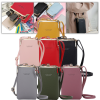
| Color | Black, Pink, Green, Light Grey, Red |
|---|
Related products
 Crossbody bag for touch screen...
You may add any content here from XStore Control Panel->Sales booster->Request a quote->Ask a question notification
At sem a enim eu vulputate nullam convallis Iaculis vitae odio faucibus adipiscing urna.